Hi, and welcome.
The information on this page has been transferred and updated at the Training Course page: What Does It Mean: Scope and Flat? Part 2.
Scope or Flat can best be shown with some examples of how it goes wrong. These drawings were made because exactly this problem happened in a local screening room for a movie screening to a room full of experts.
The intention isn’t to make fun of anyone, of course. These things happen by mistake more often than by negligence or bad repair. The screening company representative said that there was a run-through previous to the showing and everything was fine. Since she left the room after her welcome statement, we don’t know if what we saw is what she saw previously. It is possible that she didn’t know what to look or listen for, which is exactly why we need to document this. This Lesson will help you to understand this situation, recognize it right away as you do your auditorium inspections…and fix it right away.
[Here is the link for What’s It Mean: Scope and Flat Part 1]
We start with the description of the screening room. The screen is 20 foot wide according to the website’s promo. The room has 10 rows of seating with 6-8 very comfortable individual chairs in each row. People can walk in front of you without you having to scrunch. And, each row is higher than the next, so no screen view is blocked. The projector for the small auditorium is an oversized 4K Barco. It has speakers for Auro and Atmos.
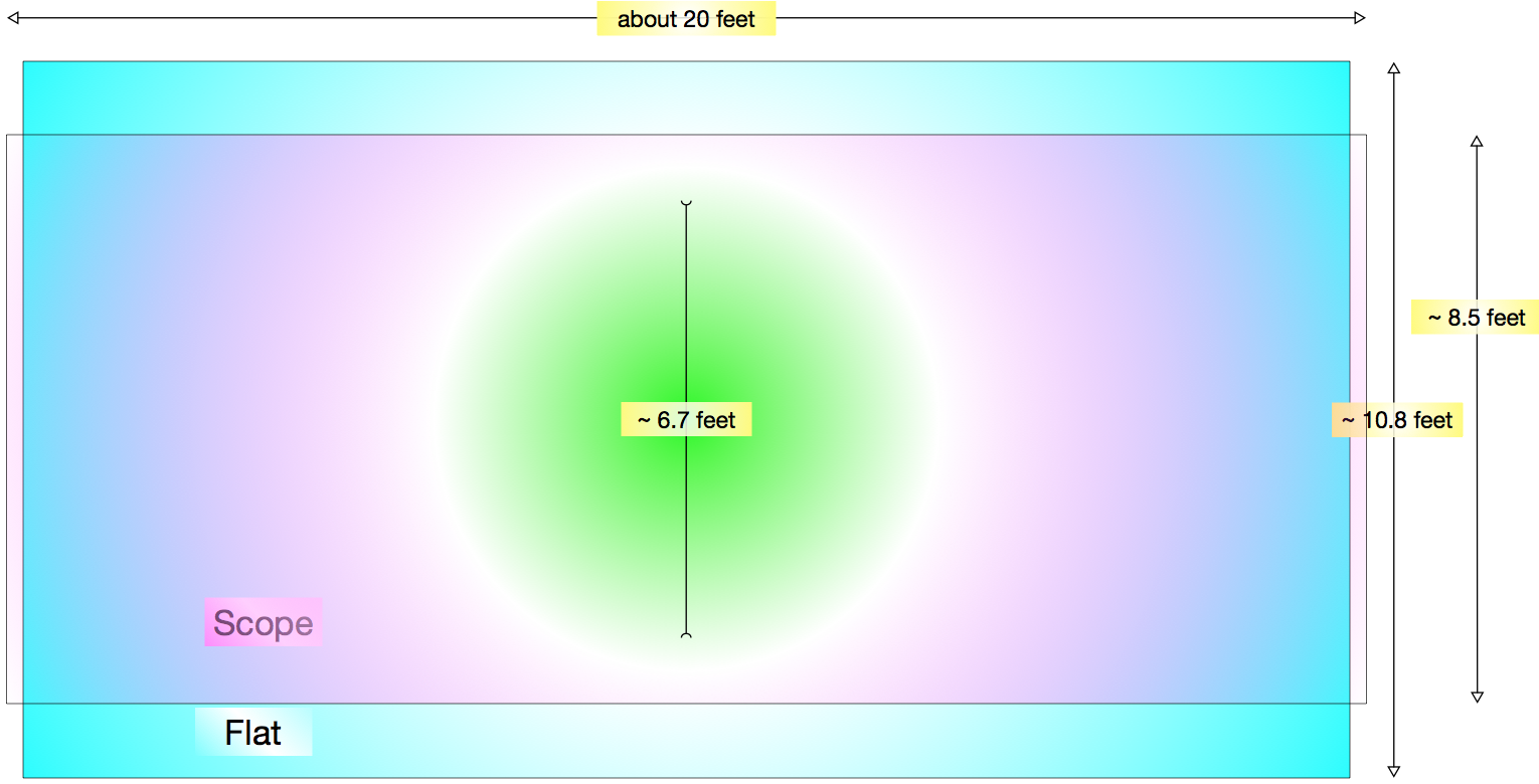
Like everything, an auditorium is a balance of compromises. For example, if an auditorium were to be built without compromise for the projector and screen, the projector would be level with the center of the screen. But auditoriums need to accommodate an audience. So, the beam of the projector is above the audience, pointing down at the center of the screen. When this happens, the top of the image is more narrow, and at the bottom of the screen the image is wider.
 This is called a keystone effect. The effect is exaggerated in this drawing. But it can be this bad in a long room with the projector high above the screen. The 2nd drawing here shows what a real keystone is, a piece that holds an arch in place.
The DCI specifications – the rules for quality and security that came from the studios and later the recommended practices and standards from the engineers at SMPTE and ISO – didn’t allow digital cinema projectors to stretch or shrink the image using ant-keystoning tricks. Perhaps they would allow this now, since the technology has improved. But back then it could have made a bad situation worse.
Eventually the projector companies designed a way to move the lens to partly help with this problem. But to really disguise this problem, and handle other problems, a technique and system that was common from the pre-digital days is used. It is called ‘masking’. Masking is made from rigid boards that move in and out from the sides and from the top and bottom to mask unused areas of the screen. The boards are covered with black velvet-like material that eats the stray light so that nothing reflects back into your eyes.
One last important thing to know before studying sizes. Black from a digital cinema projector is not black. Don’t get too excited. Black from a film projector wasn’t completely black either. If you are into the history of film, you will say, “Those films made out of nitrate were pretty black.” And that is true, but they would also start on fire, which is never convenient no matter how good the blacks looked. So, this is one of the reasons for masking – to surround the image with pure black which makes the image ‘pop’ on the screen. It gives the eyes the most contrast – which is studied in another What Does It Mean Lesson.
Without masking, the black from the projector is greyish black. That means that the black bars that replace what should be masked, are actually greyish. The extreme that contradicts is: The Dolby Vision™ projector has magic black photons, so it doesn’t need masking. But every other room should. (Just joking…photons don’t have color, even black. Black would be the absence of light, and color – but that is a different Lesson. But, to be clear, the Dolby Vision projection system is actually that great.)
OK! Vámonos! On y va! Ikimashou! Let’s Go!
The screening room where the problem happened doesn’t have masking. But it has side curtains that pull in for Flat features and out for Scope features. One of the things that this screening room does have going for it is that the full screen is made to show the full Scope image. Nice. Let’s look at those drawings from Part 1 again, this time with the pixel dimensions of 4K, and the dimensions for a screen that is 20 feet wide. We will skip the ratios since you already know: Scope is a little over 2 times wider than tall, and Flat is just a little under 2 times wider than tall. ![]()
In a perfect world, there would be a Flat screen that is 20 feet wide and just under 11 feet high to contain a full Flat-sized image, and a separate 20 foot wide screen that is about 8.5 feet high that would be perfect for a Scope-sized image. There are screening rooms that have two screens to show different images correctly. This idea of two screens also comes up when talking about alternative screens for 3D.

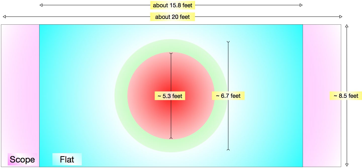
But in most rooms there is one screen that fits both, so showing one of the Flat or Scope images will be a compromise. In this case above, the Scope screen size is fit into a Flat Screen. Masking should come down from the top and up from the bottom to cover the unused section of the white screen (which is colored blue in this image.) The 50 extra pixels on each side would get easily eaten by the side masking without notice.
In the screening room that we are learning from, the screen is the perfect size to play the full width Scope picture. The Flat image is made smaller by 2 feet in heigth and 4 feet in width. It uses the same number of pixels, but the images are smaller. No complaints, since the room is small enough. Everyone gets a nice sized picture.
When we were seated in the theater, the curtains were pulled part way into the screen. The open screen seemed to have the Flat screen dimensions. Since this was a super action movie, we expected the curtains to pull all the way back to show the full Scope image.
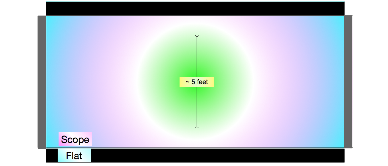
The movie was a Scope movie. But, what actually happened was not according to plan. Instead of opening up, the projector placed the scope image into the Flat image size. The top and bottom played digital black and the sides had 6 or 8 inches of the movie playing on each of the side curtains!
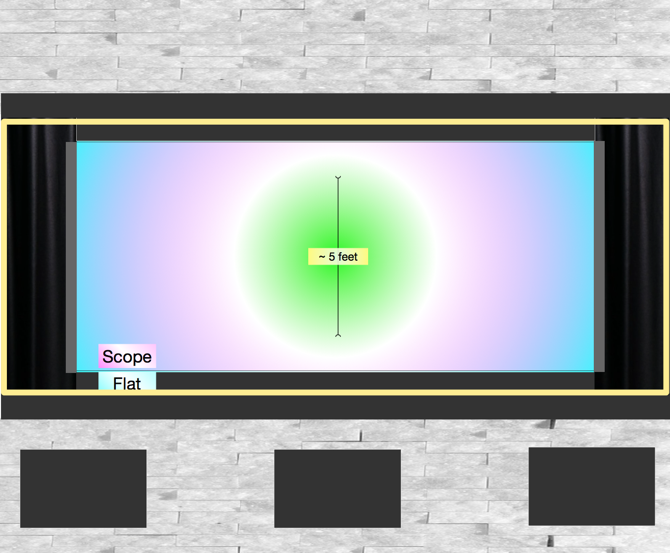
Instead of getting a picture the size of the yellow outline, this is what we got. And, worse, the curtains didn’t completely hide the 6 or 8 inches of the scope image were being shown on the curtains…the light was still able to be seen on the curtains – not completely on or off. Lesson learned. Curtains are not masking.

Now that you know what to look for, don’t let this happen to you. Run to the projection room, call the machine operator, tell them to meet you in there. Tell them to open the masking, and reset the scope size. The expansion should be able to be done smoothly so that no one will notice. But if there is a problem, stop the movie, open the port glass and apologize to the audience. They’ll be surprised, but they should thank you later.
Someday when a tech or projectionist is in the house, ask them to show you the projector and masking go from Scope to Flat or the reverse.
Just in case you are asking, the answer is: “I don’t know what those black screens are in the bottom are. I hope they were covering for the LFE (low frequency effects) speakers. I hope they were not for the main speakers.”
In case you remember your Contrast Lesson, the 2nd answer is: “Yes, a white rock wall – and the white rock sides to the room. That indeed is not ideal. Just like the conversation about masking, you don’t want any of the reflections from the screen to be going onto distracting white surfaces. Even if your suspension of disbelief is so great that they aren’t distracting, they take away from the contrast, which reduces the Artist’s Intent. Perhaps the designer didn’t want people feeling like they are in a cramped dark auditorium. Form over function, and screw the Artist’s Intent? You will notice that Dolby Vision™ auditoriums have non-reflective walls and floors and ceilings. It all matters.
The TakeAway: If your company motto is “Always deliver more than you promise”, it is your responsibility to know what you are promising, and how to recognize when you are not. Hopefully this will help.
Please use the Contact Form to ask questions or point out areas that this lesson can be improved. Thank you.